When you design your process, who is going to view the graphical description? Who is the consumer of the information provided? It is important to consider this, otherwise you may end up  having a fantastic graphical description that is not understood by those viewing it.
In the first instance when you conduct a survey of a business you usually end up with text describing the business, this is what I call a verbal description, and also with a visual representation of sequential business flow through the company or organization. It is like a map of the business. I call it a graphical description. The map showing the ‘As-Is’ state of the business may appear very chaotic and hard to follow -that is fine, because often the undesigned process of your business looks that way. It is easy to understand that a process that has not been designed to be efficient will also, be untidy when drawn for the first time. I’ll cover the ‘As-Is’ state and the map more thoroughly in another blog post, and also in my training material.
The designed process is showing what I, in my model, call the Visionary-state and also the Decided-state. The Visionary state shows the process, as we would like it to be if everything were to be ‘optimal’. By ‘optimal’ I mean, as far as we can see for the moment. As we  progress in our development we will also find a new, developed, Visionary-state.
The Decided-state shows the process as what we have decided to implement, here and now. We are constantly working with improvements towards the Visionary-state, but for now, we have the Decided-state. There will be several Decided-states, as we can decide along the way what we can change so that we are able to move forward and improve our process.
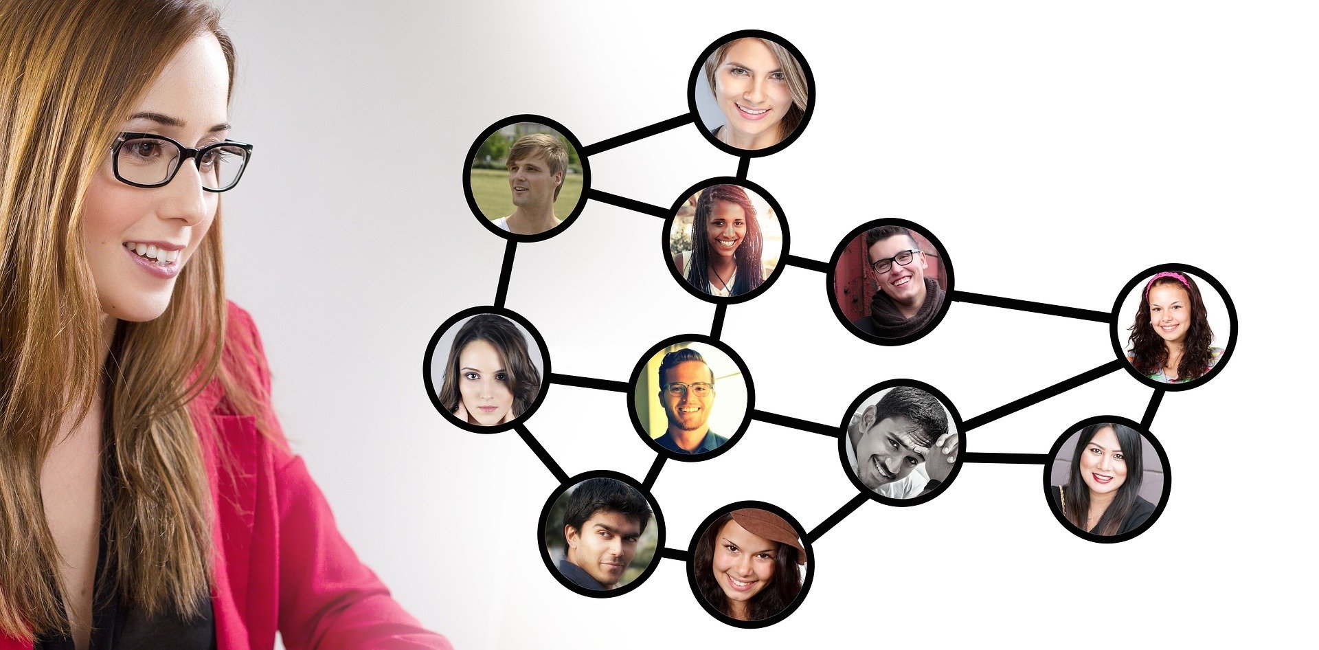
Both the Visionary-state and the different Decided-states show the designed business to the viewer. Who is the viewer then? We have to list all those in different roles both in and outside the organization who are going to view our designed business. Remember, that the process is the business, not something that is drawn on the side, so everybody that is interested in our business will have to view this graphical representation of the business.
A viewer of a business includes :
- Those doing the work within a certain process who need the detailed information and relevant information of documents and operational systems.
- The management of that process, or of an overall process, who wants to understand the process more generally.
- Partners working within the process who need to understand in what area they act and the importance of what they deliver – also to understand what leads up to what they get as an input for their work.
- Investors in the business who want to understand what they actually invest in.
- Board of Directors who want to see what the overall flow of customer-value-creation is.
- Supervisory authorities who want to make sure that the process flow operates according to rules and regulations.
- …
We cannot show the designed process in a way that suits all consumers and their respective interests. That would be an all too chaotic graphical description. The process is the same, but we need to make sure that we show each and everyone the process with the information that is relevant to them. Some require more details than others and some need information in a graphical representation, which to others may be totally irrelevant.
To use an image – a world map can be drawn in many ways, meaning that you can have several maps showing the world:
- A map showing the topography, where we can understand where the high mountains and deep valleys are.
- Or a map showing the continents in different colours just to explain them to the viewer.
- Â A map can show the political landscape around the world, where different colours mean different political parties.
- A beautiful world view that I have seen on late night TV with rolling news flow, consists of a map showing where there is daylight and where it is night, and also showing the location of densely populated areas, indicated by the lights from cities.
- I remember a map from the time of the cold war that indicated with colours, countries in relation to their sympathies. Red was The Soviet Union and the Warsaw pact, and  The US and NATO were blue, and other colours represented those that were neutral or in some other configuration.
Whatever set up of the map we select – Â it is still planet Earth that we depict. There is not one map of Mars and another of Venus and the third of Earth. This would be like showing different processes or different business.
So you have to understand the needs of the viewer, the consumer of information, to understand how you want to present the graphical description of the process. Remember that it is the same process, but from different viewpoints. Make sure that you select a tool that helps you to show the different viewpoints, otherwise you will end up  having a huge amount of work maintaining the descriptions. That is not good at all, because the more the work to maintain it, the longer it will be between updates of the description. It is most likely that if the viewer cannot be sure that the information is correct, then they will start to distrust the description and look for the information elsewhere.;
How many different graphical descriptions of a process do you have in your business? Please comment!
To your Excellence!
Matts
PS. If you want to have more free material regarding Business Excellence, please sign up for the newsletter on the right hand side.

